Visualizing Haskell heap profiles in 2020
Published on ; updated on
Heap profiling is a feature of the Glasgow Haskell Compiler (GHC)
that lets a program record its own memory usage by type, module, cost
center, or other attribute, and write it to a program.hp
file.
Here I review the existing tools—and introduce a new one—for visualizing and analyzing these profiles.
hp2ps
hp2ps is the standard heap profile visualizer, as it comes bundled with GHC.
Run it as
hp2ps -c benchmark.hp(where -c makes the output colored), and it will produce
the file benchmark.ps, which you can open with many
document viewers.
Here’s what the output looks like:

The example shows a heap profile by the cost center stack that allocated the data. As I mentioned, there are many other types of heap profiles, but this is what I’ll be using here as an example.
As you see, the cost centers on the right are truncated. I usually
like to see them longer. They are actually truncated by the profiled
program itself, not by the visualizer, so to get longer profiles, rerun
your program with +RTS -hc -L500 to increase the maximum
length from the default 25 to, say, 500.
However, hp2ps doesn’t deal well with long cost center stacks (or
other long identifiers) by default: the whole page would be filled with
identifiers, and there would be no room left for the graph itself. To
work around that, pass -M to hp2ps. It produces a two-page
.ps file, with the legend on the first page and the graph on the second
one.
I found that viewers like Okular and Evince only display the second page of the two-page .ps file, but it works if you first convert the output to pdf with ps2pdf. Here’s what the output looks like:


hp2pretty
hp2pretty by Claude Heiland-Allen has a few advantages over hp2ps: a
nicer output with transparency and grid lines, truncation of long cost
center stacks, and the ability to write the full cost center stacks to a
file using a --key option.
Run it simply as
hp2pretty benchmark.hpand it will produce a file named benchmark.svg.

hp/D3.js
hp/D3.js by Edward Z. Yang is an online tool to visualize Haskell heap profiles. There’s a hosted version at heap.ezyang.com, and there is the source code on GitHub.
I wasn’t able to build the source code due to the dependency on hp2any (see below), but the hosted version still works. The disadvantage of the hosted version is that you have to upload your heap profile to the server, and it becomes public—consider this when working on proprietary projects. (The profile files do not contain any source code, but even the function names and call stacks may reveal too much information in some cases.)
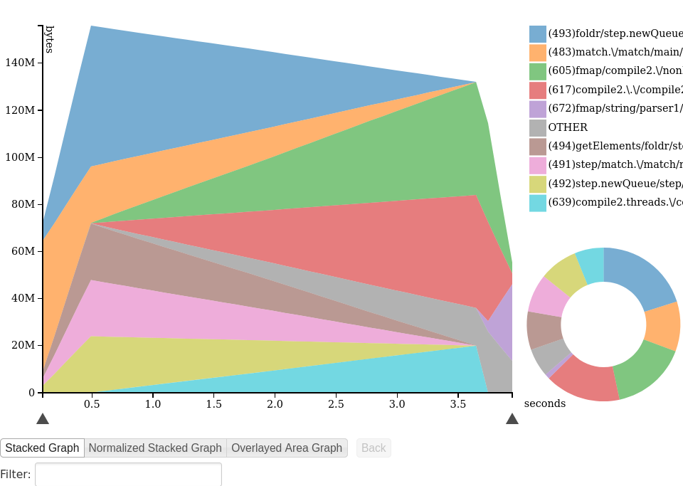
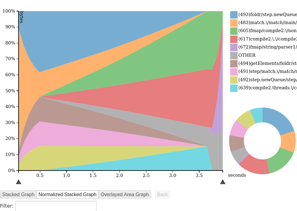
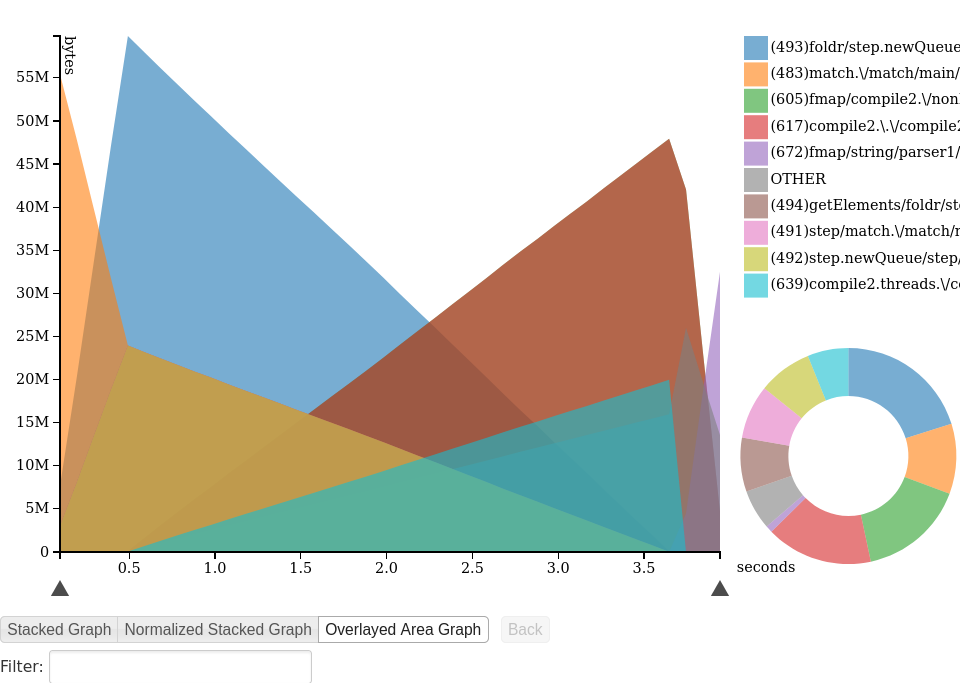
hp/D3.js offers a choice of three different styles of pretty graphs shown below. You can also browse this profile yourself. There are some cool interactive features, like the entry’s name or call stack being highlighted when you hover the corresponding part of the graph.


Perl & R
Sometimes a quick look at the heap profile graph is all you need to understand what to do next. Other times, a more detailed analysis is required. In such cases, my favorite way is to convert an .hp file to csv and load it into R.
To convert an .hp file to csv, I wrote a short Perl script, hp2csv.
(Unlike many tools written in Haskell, there’s a good chance it’ll
continue working in 10 years.) Put it somewhere in your PATH, make it
executable (chmod +x ~/bin/hp2csv), and run
hp2csv benchmark.hp > benchmark.csvThe CSV has a simple format:
time,name,value
0.094997,(487)getElements/CAF:getElements,40
0.094997,(415)CAF:$cfoldl'_r3hK,32
0.094997,(412)CAF:$ctoList_r3hH,32
0.094997,(482)match/main/Main.CAF,24
0.094997,(480)main/Main.CAF,32
where time is the time in seconds since the program
start, name is the name of the cost center/type/etc.
(depending on what kind of heap profiling you did), and
value is the number of bytes.
Now let’s load this into R and try to reproduce the above graphs using ggplot.
library(tidyverse)
library(scales) # for a somewhat better color scheme

csv <- read_csv("benchmark.csv") %>%
  # convert bytes to megabytes
  mutate(value = value / 1e6) %>%
  # absent measurements are 0s
  complete(time,name, fill = list(value = 0))


# find top 15 entries and sort them
top_names <- csv %>%
  group_by(name) %>%
  summarize(sum_value = sum(value)) %>%
  arrange(desc(sum_value)) %>%
  head(n=15) %>%
  mutate(name_sorted = str_trunc(name,30),
         name_sorted = factor(name_sorted, levels=name_sorted))
top_entries <-
  inner_join(csv, top_names, by="name")

# Create a custom color palette based on the 'viridis' palette.
# Use 'sample' to shuffle the colors,
# so that adjacent areas are not similarly colored.
colors <- function(n) {
  set.seed(2020)
  sample(viridis_pal(option="A",alpha=0.7)(n))
}

theme_set(theme_bw())
ggplot(top_entries,aes(time,value,fill=name_sorted)) +
  geom_area(position="stack") +
  discrete_scale(aesthetics = "fill",
                 scale_name = "viridis modified",
                 palette = colors) +
  scale_y_continuous(breaks=function(limits) seq(0, floor(limits[[2]]), by=10)) +
  labs(x="seconds", y="MB", fill = "Cost center")
But these stacked plots are not always the best way to represent the data. Let’s see what happens if we try a simple line plot.
top_entries %>%
  ggplot(aes(time,value,color=name_sorted)) +
    geom_line() +
    scale_y_continuous(breaks=function(limits) seq(0, floor(limits[[2]]), by=5)) +
    labs(x="seconds", y="MB", color = "Cost center")
This looks weird, doesn’t it? Do those lines merge, or does one of them just disappear?
To disentangle this graph a bit, we can add a random offset for each cost-center.
set.seed(2020)
top_entries %>%
  group_by(name) %>%
  mutate(value = value + runif(1,0,3)) %>%
  ungroup %>%
  ggplot(aes(time,value,color=name_sorted)) +
    geom_line() +
    scale_y_continuous(breaks=function(limits) seq(0, floor(limits[[2]]), by=5)) +
    labs(x="seconds", y="MB", color = "Cost center")
So it’s not a glitch, and indeed several cost centers have identical dynamics. It’s not hard to imagine why this could happen: think about tuples whose elements occupy the same amount of space but are produced by different cost centers. As these tuples are consumed and garbage-collected, the corresponding lines remain in perfect sync. But this effect wasn’t obvious at all from the stacked plot, was it?
Another thing that is hard to understand from a stacked plot is how different cost centers compare, say, in terms of their maximum resident size. But in R, we can easily visualize this with a simple bar plot:
top_entries <- csv %>%
  group_by(name) %>%
  summarize(max_value = max(value)) %>%
  filter(max_value >= 1) %>%
  arrange(max_value) %>%
  mutate(name = str_trunc(name, 120), name = factor(name, levels=name))
ggplot(top_entries, aes(name,max_value)) + geom_col(fill=viridis_pal(alpha=0.7)(5)[[4]]) +
  geom_text(aes(name,label=name),y=0,hjust="left") +
  labs(x="Cost center", y="Memory, MB") +
  scale_x_discrete(breaks=NULL) +
  scale_y_continuous(breaks=function(limits) seq(0, floor(limits[[2]]), by=5)) +
  coord_flip()
Finally, in R you are not limited to just visualization; you can do all sorts of data analyses. For instance, a few years back I needed to verify that, in a server process, a certain function was not consuming increasingly more memory over time. I used this technique to load the heap profile into R and verify that with more confidence that I would have had from looking at a stacked graph.
hp2any
One issue with big Haskell projects is that, if not actively maintained, they tend to bitrot due to the changes in the compiler, the Haskell dependencies or even the C dependencies.
One such example is Patai Gergely’s hp2any. It no longer builds
with the current version of the network package because of
some API changes. But even when I tried to build it with the included
stack.yaml file, I got
glib          > Linking /tmp/stack214336/glib-0.13.6.0/.stack-work/dist/x86_64-linux-tinfo6/Cabal-2.2.0.1/setup/setup ...
glib          > Configuring glib-0.13.6.0...
glib          > build
glib          > Preprocessing library for glib-0.13.6.0..
glib          > setup: Error in C header file.
glib          >
glib          > /usr/include/glib-2.0/glib/gspawn.h:76: (column 22) [FATAL]
glib          >   >>> Syntax error!
glib          >   The symbol `__attribute__' does not fit here.
glib          >
I’m guessing (only guessing) that this issue is fixed in the latest
versions of the glib Haskell package, but we can’t benefit from that
when using an old stack.yaml. This also shows a flaw in
some people’s argument that if you put prospective upper bounds on your
Haskell dependencies, your projects will build forever.
(At this point, someone will surely mention nix and how it would’ve helped here. It probably would, but as an owner of a 50GB /nix directory, I’m not so enthusiastic about adding another 5GB there consisting of old OpenGL and GTK libraries just to get a heap profile visualizer.)